Two Hotels. Two Places. One Purposeful Approach to Signage.
 Working with Atlanta-based architect and interior designer BLUR Workshop, Lorenc Design created the experiential graphics and signage for Hotel Indigo Grand Cayman and Hotel Polaris in Colorado Springs. Together, the projects demonstrate the delicate double task of hotel signage: it must guide guests quickly and confidently, yet feel inseparable from the character of the destination.
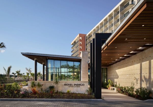
At Hotel Indigo Grand Cayman, the experience begins in the landscape. The architecture opens toward gardens and water, and the arrival sign follows that same calm logic. Dark, crisply spaced lettering sits directly on a low wall of pale stone, framed by tropical planting and the deep overhang of the entry canopy. The sign does not compete with the architecture; it completes the composition. Its contrast makes the hotel name easy to read, while its scale keeps the arrival relaxed and resort-like.
That restraint suits a property organized around views of the Caribbean Sea and Governor’s Bay. According to the supplied project notes, the hotel includes 282 guestrooms, pools for adults and families, a ballroom, meeting space, outdoor event areas, and a rooftop bar. In a destination with many possible paths and amenities, the value of the graphic system lies in making orientation feel natural. Identification becomes part of the threshold, not an afterthought applied to it.
Hotel Polaris takes the opposite visual route. Located near the United States Air Force Academy at the foot of the Rocky Mountains, the hotel and conference center draws on aviation history and the Academy’s midcentury design legacy. Lorenc Design’s environmental graphics answer that setting with strong names, bold geometry, and moments of theatrical illumination.
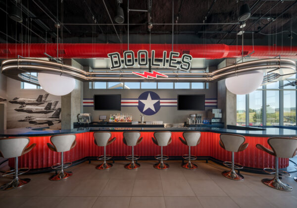
At Doolies, dimensional letters rise above a streamlined, glowing canopy. Red, white, and blue bands and the star-and-bar insignia connect the venue to flight culture, while the typography gives the room the energy of a vintage hangar or officers’ club.
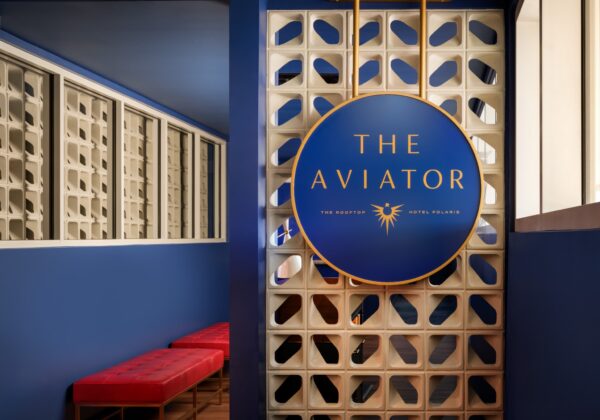
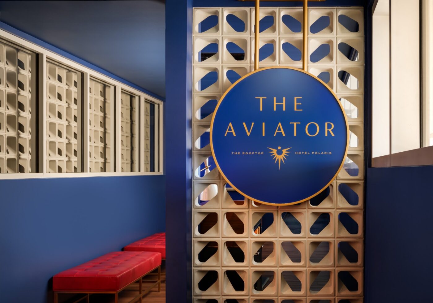
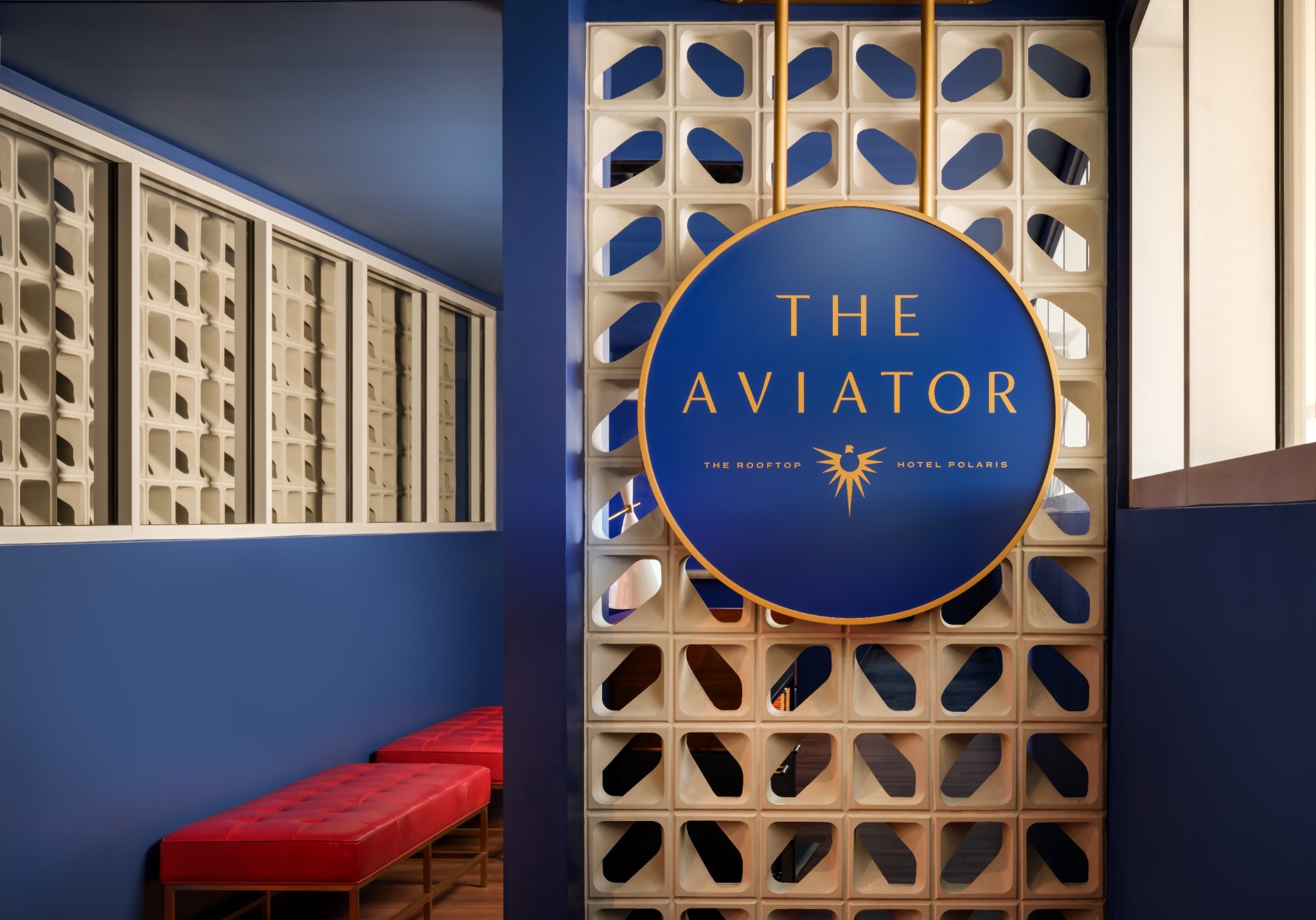
The Aviator shifts the mood: a deep-blue circular medallion, edged and lettered in warm gold, is suspended against a custom breeze-block screen. The sign is both identifier and architectural focal point, revealing patterned views through the wall around it.
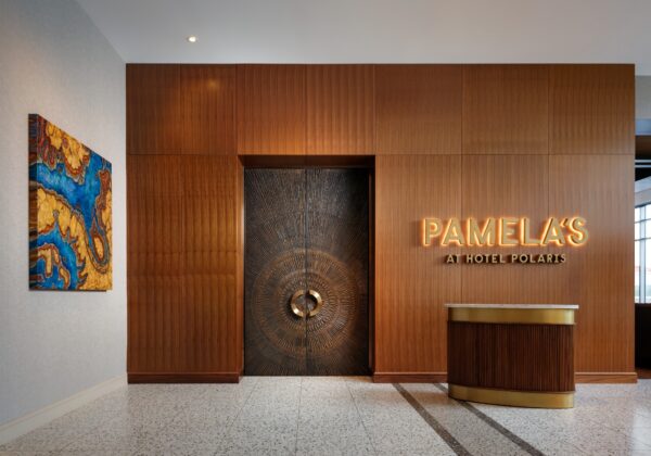
At Pamela’s, softly illuminated letters are set into rich wood paneling beside a monumental pair of doors, creating an arrival that feels quieter and more formal.
These are not interchangeable sign families pasted into different properties. In Grand Cayman, signage recedes into stone, planting, and sunlight. At Polaris, it becomes part of the storytelling—sometimes nostalgic, sometimes sculptural, yet always integrated with the room it names.
What joins the two projects is a shared discipline: clear information, careful placement, and a visual language shaped by place.