Making Large Convention Centers Legible
 Working with architect and interior designer TVS on the Charlotte and Savannah convention-center expansions—and with Hansen Architects serving as associate architect in Savannah—Lorenc Design created experiential graphics and wayfinding systems that make two larger, more capable facilities easier to understand.
Convention centers are small cities under one roof. On event days, thousands of people arrive at once, often unfamiliar with the building, focused on schedules, and moving among exhibit halls, ballrooms, meeting rooms, hotels, parking, and transit.
Charlotte’s challenge began with constraint. The original TVS-designed convention center opened in 1995, but its landlocked site left little room to grow outward. The expansion therefore moved upward, adding meeting and prefunction space above existing exhibit halls and creating a new public face along Stonewall Street. It also strengthened connections to the Westin Charlotte and nearby light rail.
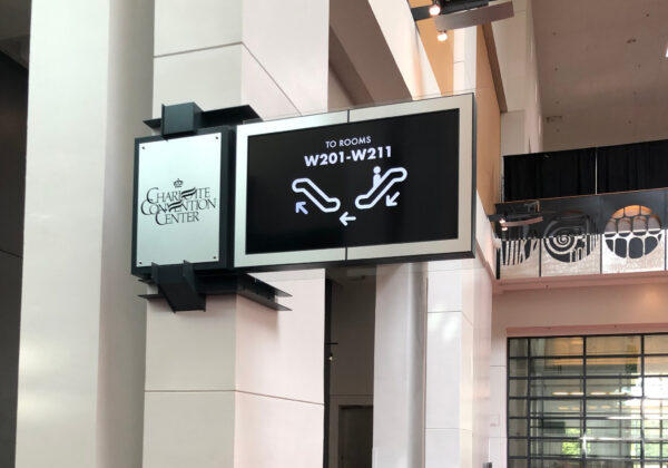
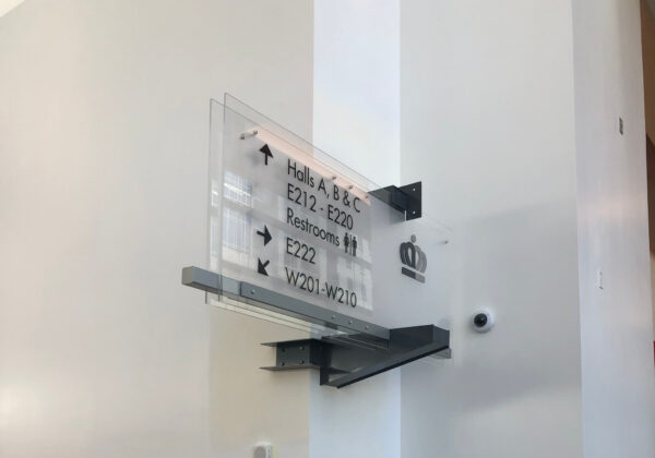
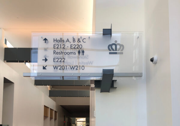
The wayfinding responds with a direct, high-contrast system designed for decision-making at walking speed. Suspended directional signs place arrows, room destinations, and amenity symbols in a consistent hierarchy. Large numerals and concise labels can be read before visitors reach an intersection. Digital panels add changeable information where programs shift from one event to the next. Against the center’s white structural surfaces and vivid red interior accents, the largely black-and-white signs remain visible without adding visual noise.
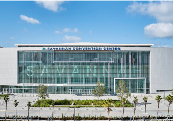
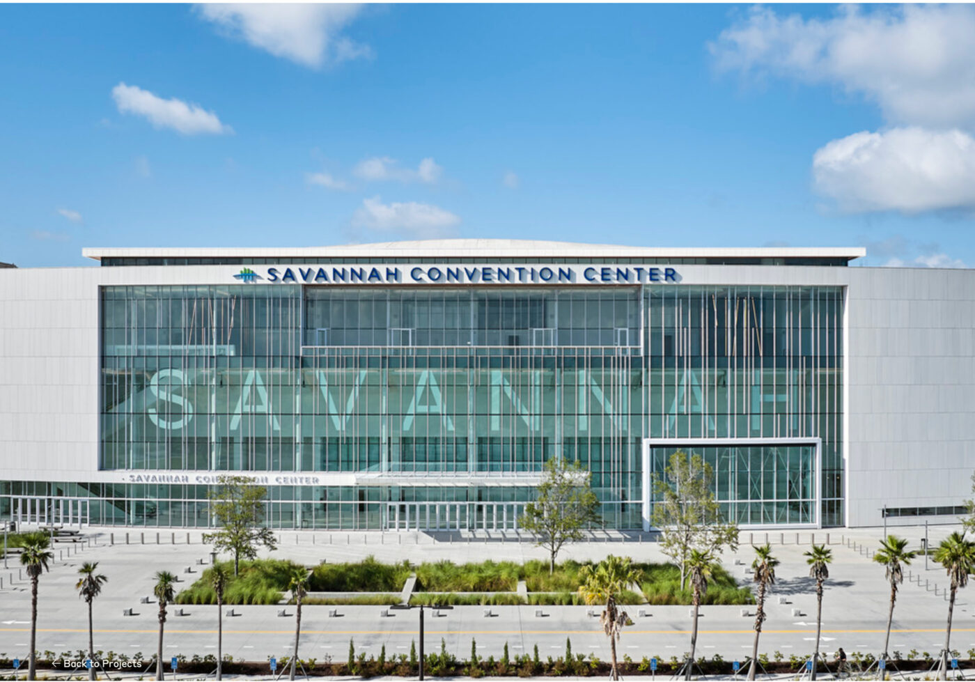
Savannah presents a different context. Set on Hutchinson Island across the river from the city’s historic district, the convention center expansion doubled the facility’s exhibit capacity and added a ballroom, meeting rooms, arrival plazas, registration areas, and structured parking.
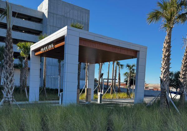
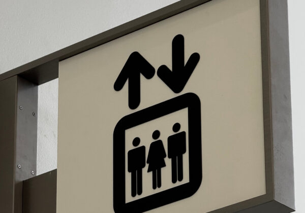
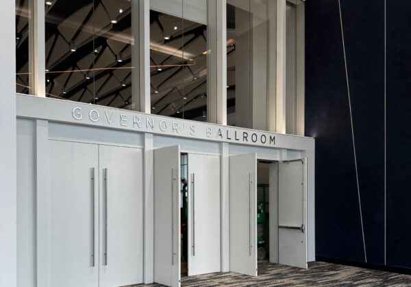
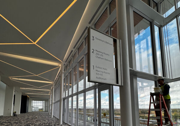
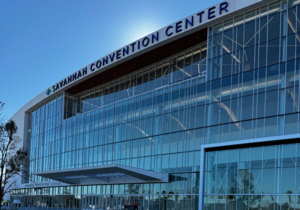
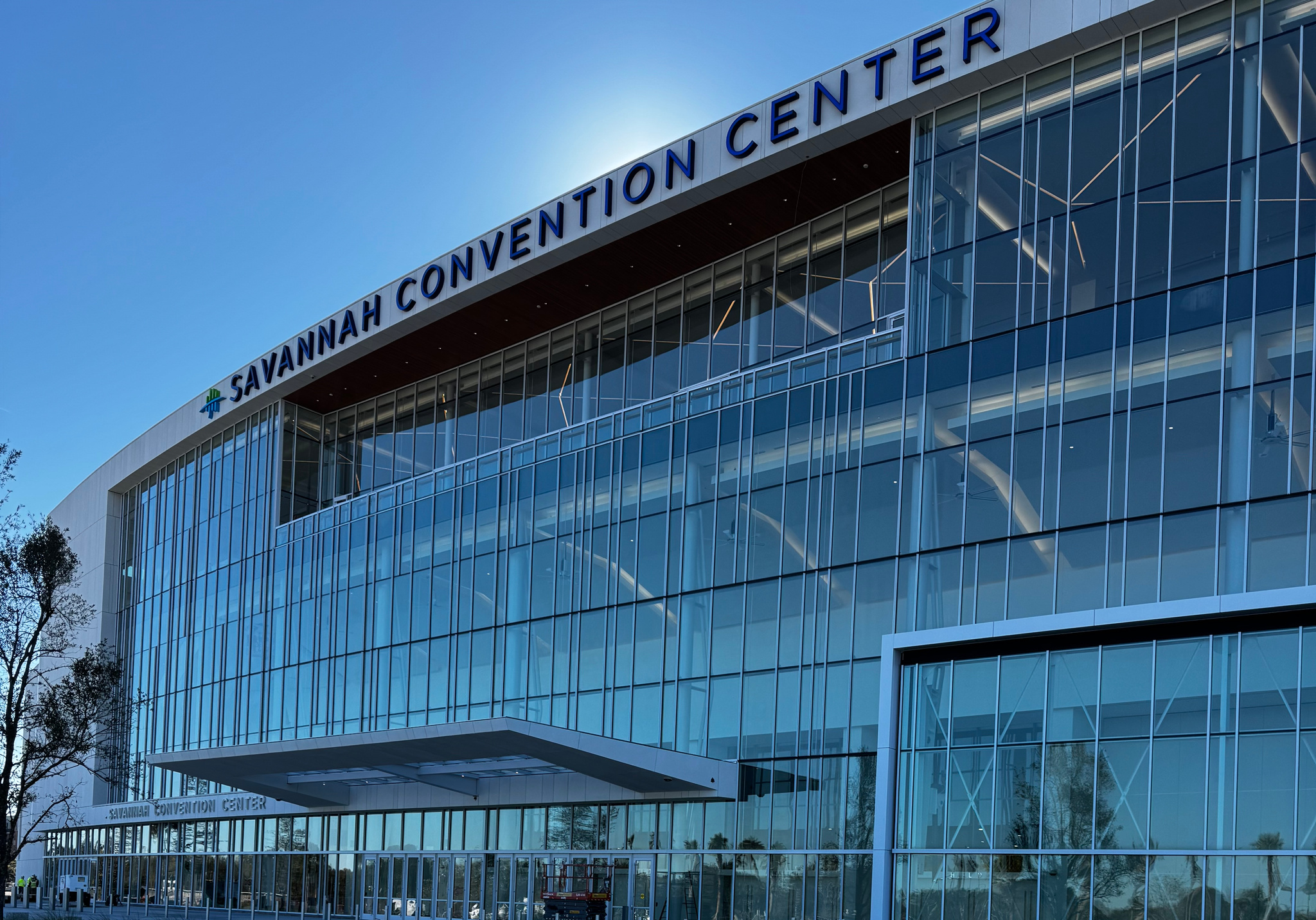
Here, Lorenc Design’s system moves between civic scale and close-up guidance. Across the exterior, large identification letters align with the glass facade and entrance canopy, making the building’s purpose clear from the broad arrival plaza. Inside, oversized “BALLROOM” lettering turns a wall into a landmark. Suspended directionals attach cleanly to columns and structural frames, while elevator symbols and simple pictograms answer immediate questions without requiring visitors to stop and study a map.
The two projects demonstrate why convention-center wayfinding cannot be separated from architecture. Charlotte required a system that clarified new vertical connections and linked the facility more closely to the city around it. Savannah required a coherent path through a greatly expanded waterfront complex, from monumental arrival to individual room. In both, Lorenc Design treated signage as part of the building’s operating structure: visible at the right moment, consistent across long distances, and quiet enough to let the architecture remain present.
Good wayfinding rarely calls attention to the effort behind it. Its success is measured in confidence—the guest who chooses the correct corridor, finds the ballroom, reaches a meeting on time, and remembers the building as welcoming rather than overwhelming.