Client: Phillips Edison
Location: Las Vegas
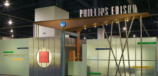
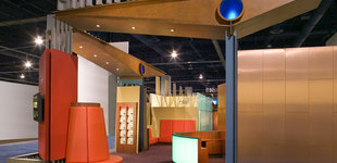
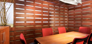
Designed as an exciting and inviting space, Lorenc+Yoo Design used a unique western-derived visual language of diverse materials, rich warm colors, and bold modern forms to create an exhibit that welcomes visitors into a sophisticated interior environment that communicates craftsmanship and excitement. At the exhibit’s entrance threshold, a cantilevered seesaw-shaped wedge beam of faux rusted steel projects overhead and supports the company’s name, made of thick dimensional letters. The four-foot-wide beam is supported by a composition typical of raw construction elements, beams and circular pipe.


