 Down the road from Philadelphia and a short drive from Baltimore, Christiana Mall is a center for shopping and socializing in Newark, Delaware. Always a destination with its tax-free shopping, owner General Growth Properties sought to revamp the mall’s image last year, and chose Lorenc+Yoo Design to revise its graphics and wayfinding systems.
The new signage system encompasses three main parts: exterior wayfinding, exterior signage, and interior wayfinding pieces. The goal of the project was to unify each element of the system to provide mall-goers with a consistent branding presence from the time they drive into the parking lot.
The exterior wayfinding pieces include pieces that combine the traditional with the contemporary. Seated on a sandstone base, burgundy pillars support large text, bookended on one side by the distinct red logo of the mall. Guidance to the mall’s anchor stores sit beneath on horizontal pieces of steel that instinctively point the way.
 The approach into the actual mall is even more dramatic. Where before the mall’s entrances were unmarked and generic, one entrance now frames a cutout of the Christiana Mall logo, lit red from the inside. Another entrance has the logo placed in the 2 o’clock position, providing a more modern stylized variation.
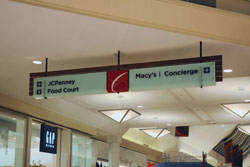
Inside, red dominates again, both on banners and directional pieces hanging from the ceiling. After a study of traffic patterns in the mall, Lorenc+Yoo’s team placed pieces at specific points where they would be most useful to guests. Acrylic and painted metal comprise the main elements of these signs, and provide a sense of quality to shoppers.