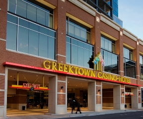
 Located in Detroit’s historic Greektown district, a vibrant neighborhood popular for its eclectic mix of restaurants and pastry shops, Greektown Casino Resort is a popular entertainment destination in the heart of the city. Lorenc+Yoo Design approached the task of developing a fresh new signage system for the casino – named Detroit’s best casino by Midwest Gaming & Travel and Casino Journal – by focusing on context, ease of use and adding splashes of color to help the casino stand out in its busy neighborhood.
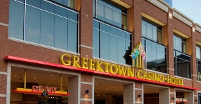
Lorenc+Yoo worked with the architects of Hnedak Bobo Group to create a unified design for the 60,000-sq. ft. casino expansion and 400-room hotel. Paying homage to the neighborhood’s mostly brick-based architecture, the casino has a brick façade on the street level, which immediately shifts to glass as the 30-story tower rises. In the same vein, the main signage uses classical typefaces to correlate with the casino’s surroundings. The red glow of the sign on the top of the tower draws a visual connection to the red, brick base.
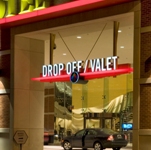
 In all of its signage and wayfinding designs, Lorenc+Yoo’s primary objective is to provide guests, staff and other visitors with the easiest way to navigate their surroundings. From the moment visitors pull into the Greektown Casino garage or pass their car to a valet, clear, attractive signage marks the way. Inside, overhead directional pieces, accented with classical Greek key shapes and letters, direct visitors through the entire 500,000 sq. ft. campus.
Lorenc+Yoo used bold reds, bright yellows and regal golds to make the casino stand out in the lively streets of Greektown and give it a timeless sense of style. Outside, the signage atop the hotel and casino glows from within, giving it the illusion of floating in the sky. Color cues not only add dramatic elements to the signage, but also help visitors navigate. While the valet entrance glows white, the exit sign shines red to prevent visitors from entering the wrong way. Additionally, the design team integrated the casino’s five-torch logo into many of the pieces, adding a bit more punch and complementing its visual brand identity.
 Lorenc+Yoo’s work on Greektown Casino’s expansion and design refresh provides visitors with a sense of place, enhancing the casino’s highly rated reputation and keeping business booming.