Sony Ericsson Brand Launch
Client: Sony Ericsson
Location: Las Vegas, Nevada
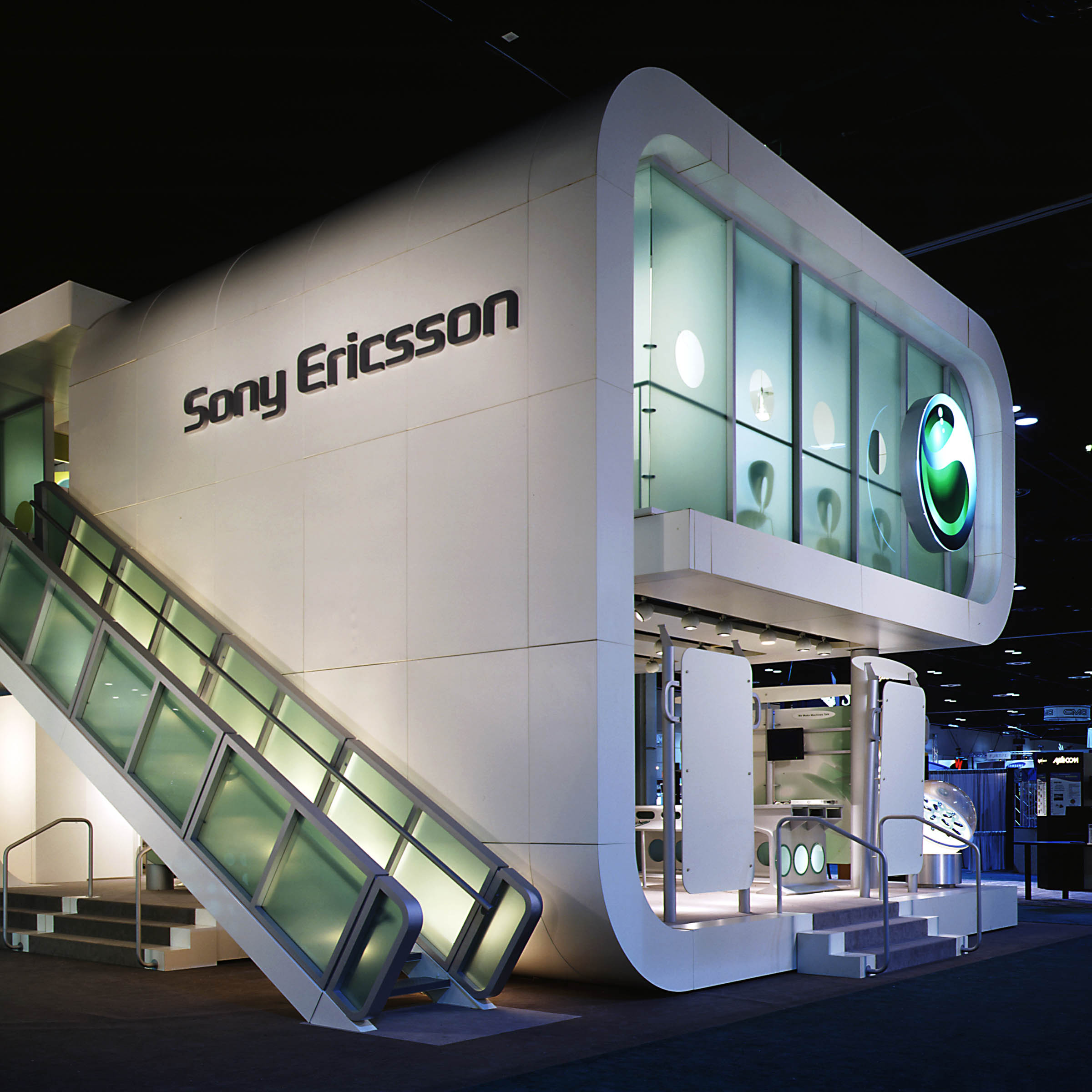
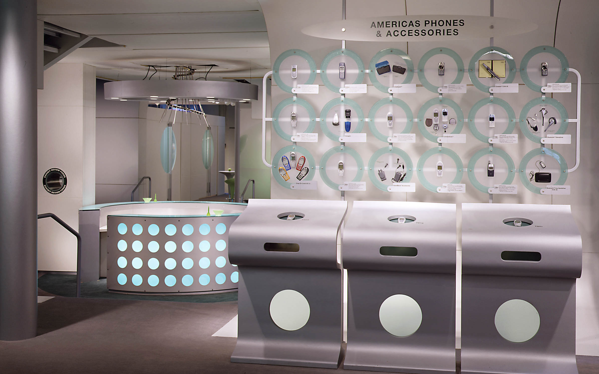
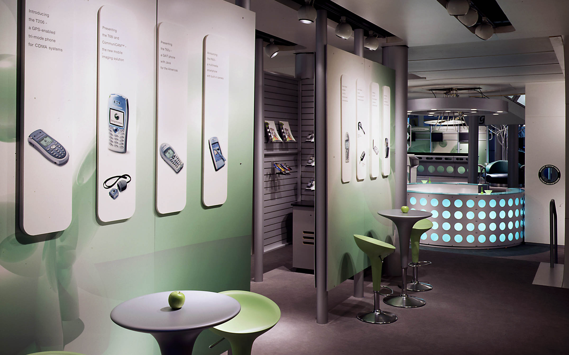
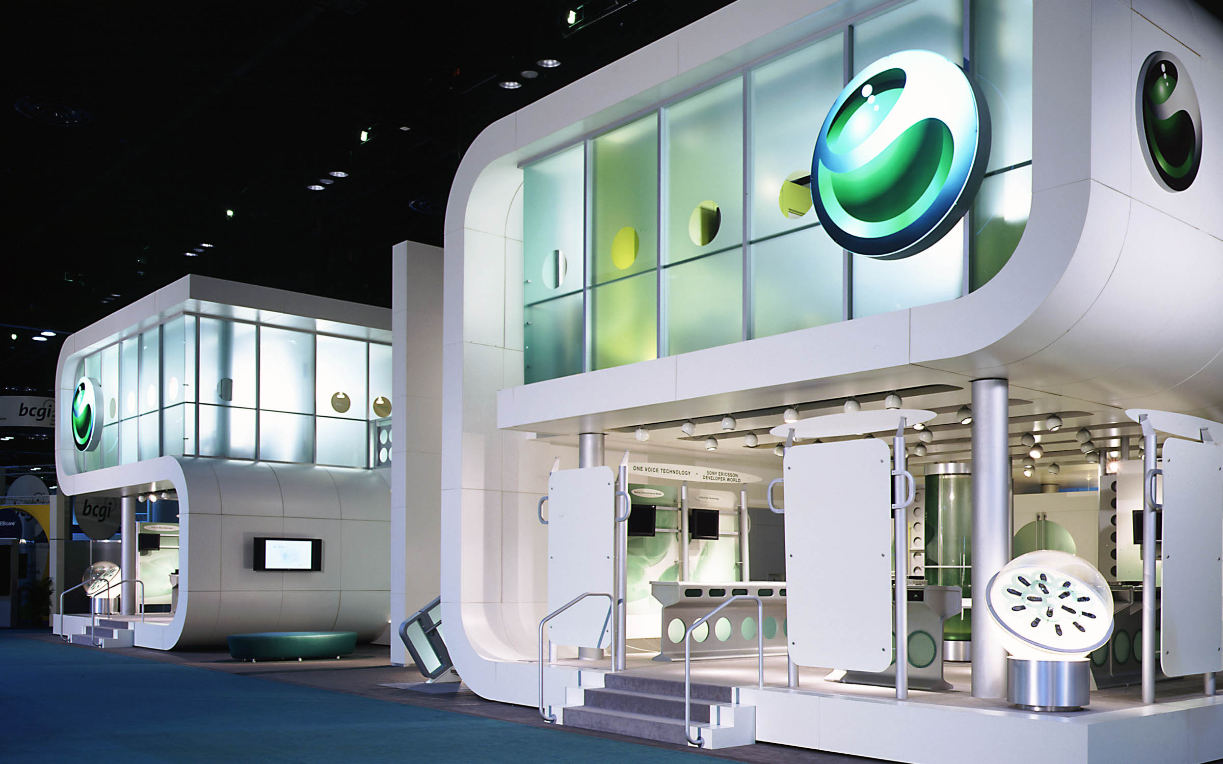
The joint venture of Sony and Ericsson, two giants in consumer electronics and cellular telecommunications, required a dramatic custom exhibit design that would catch the attention of visitors at the annual Cellular Telecommunications & Internet Association (CTIA) show and educate them on the new company’s product offerings.
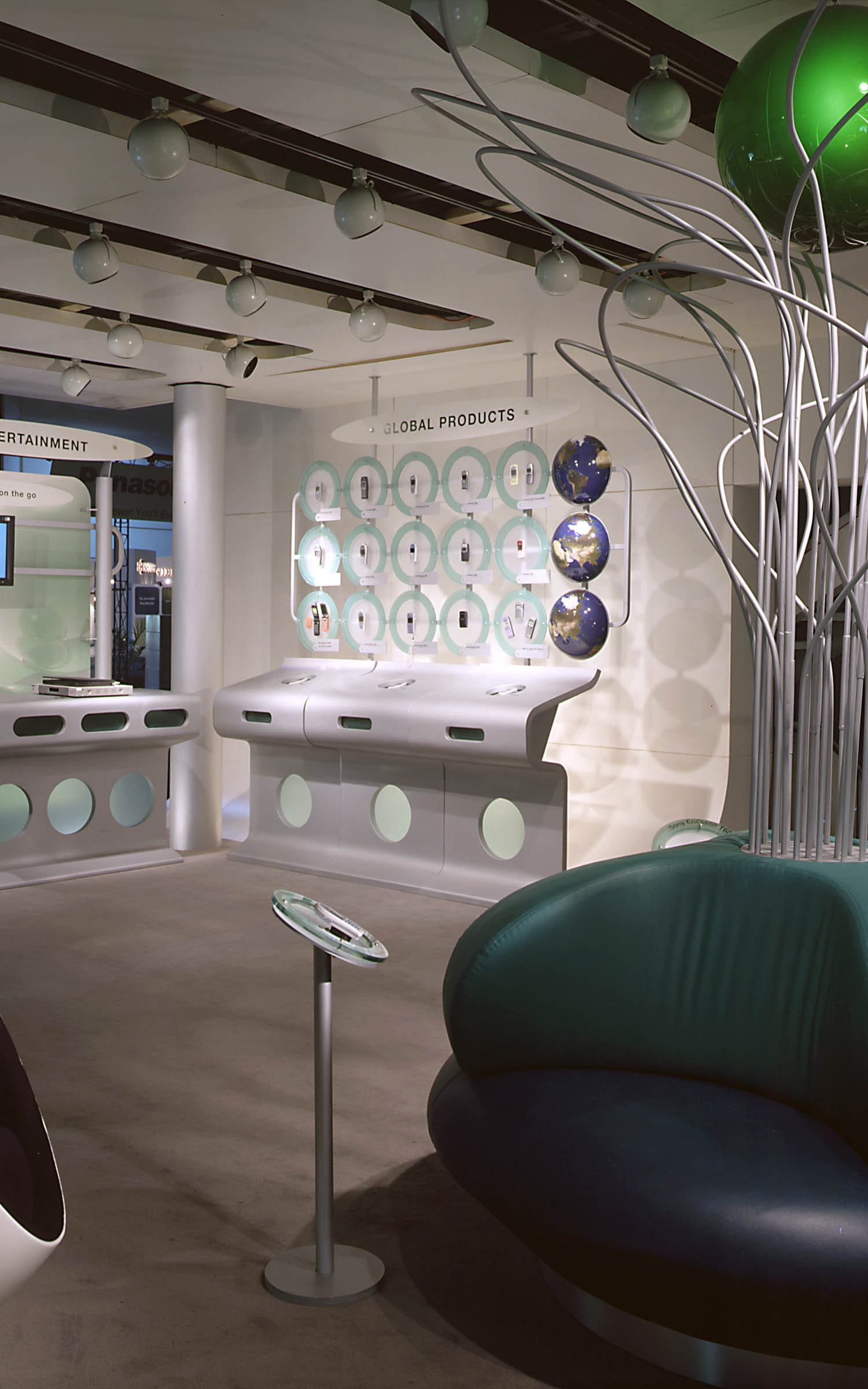
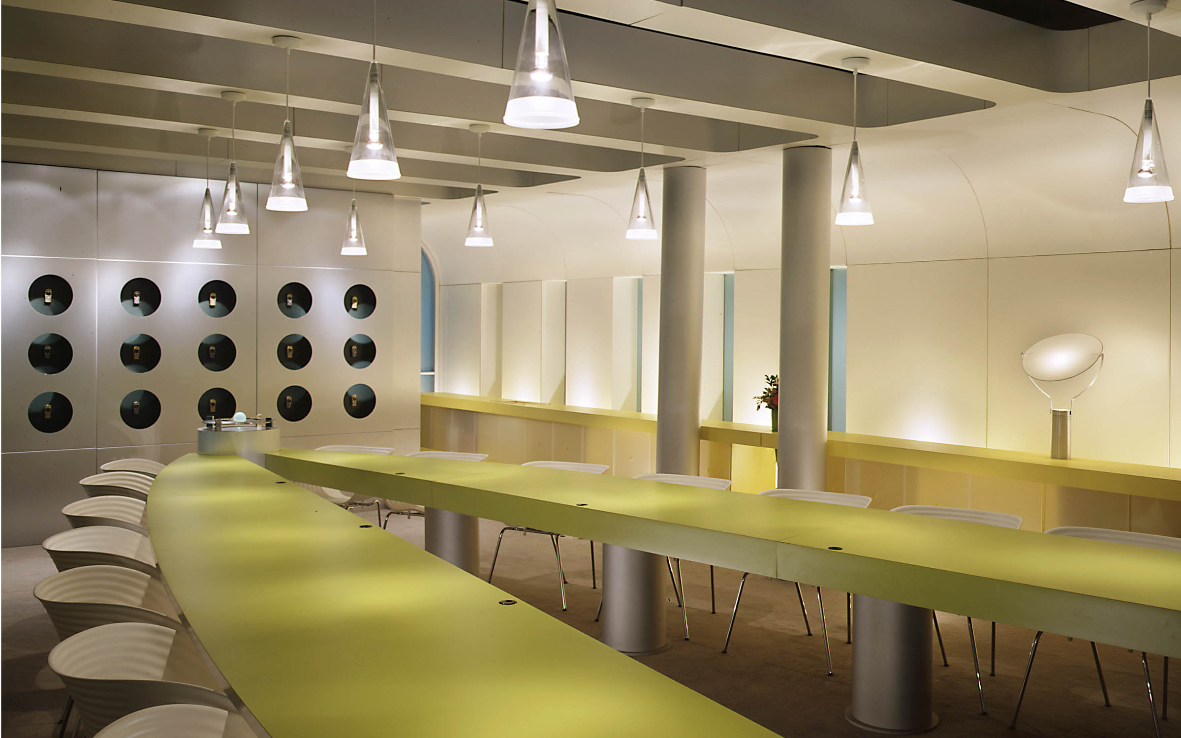
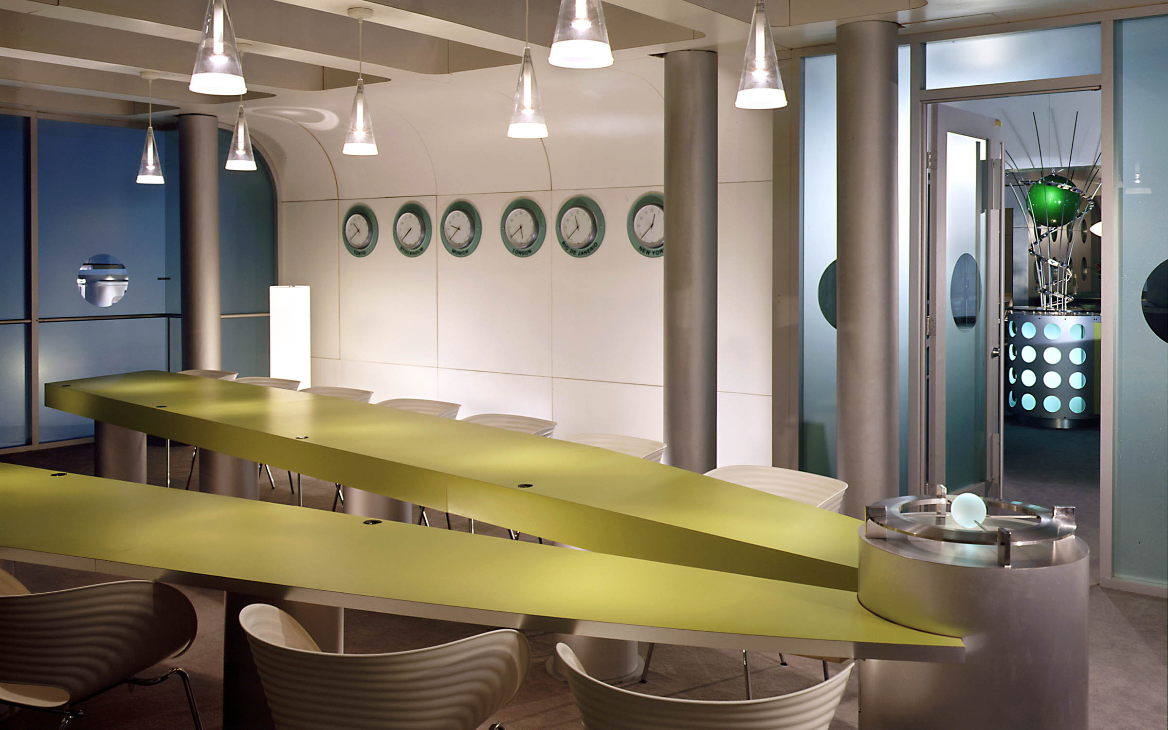
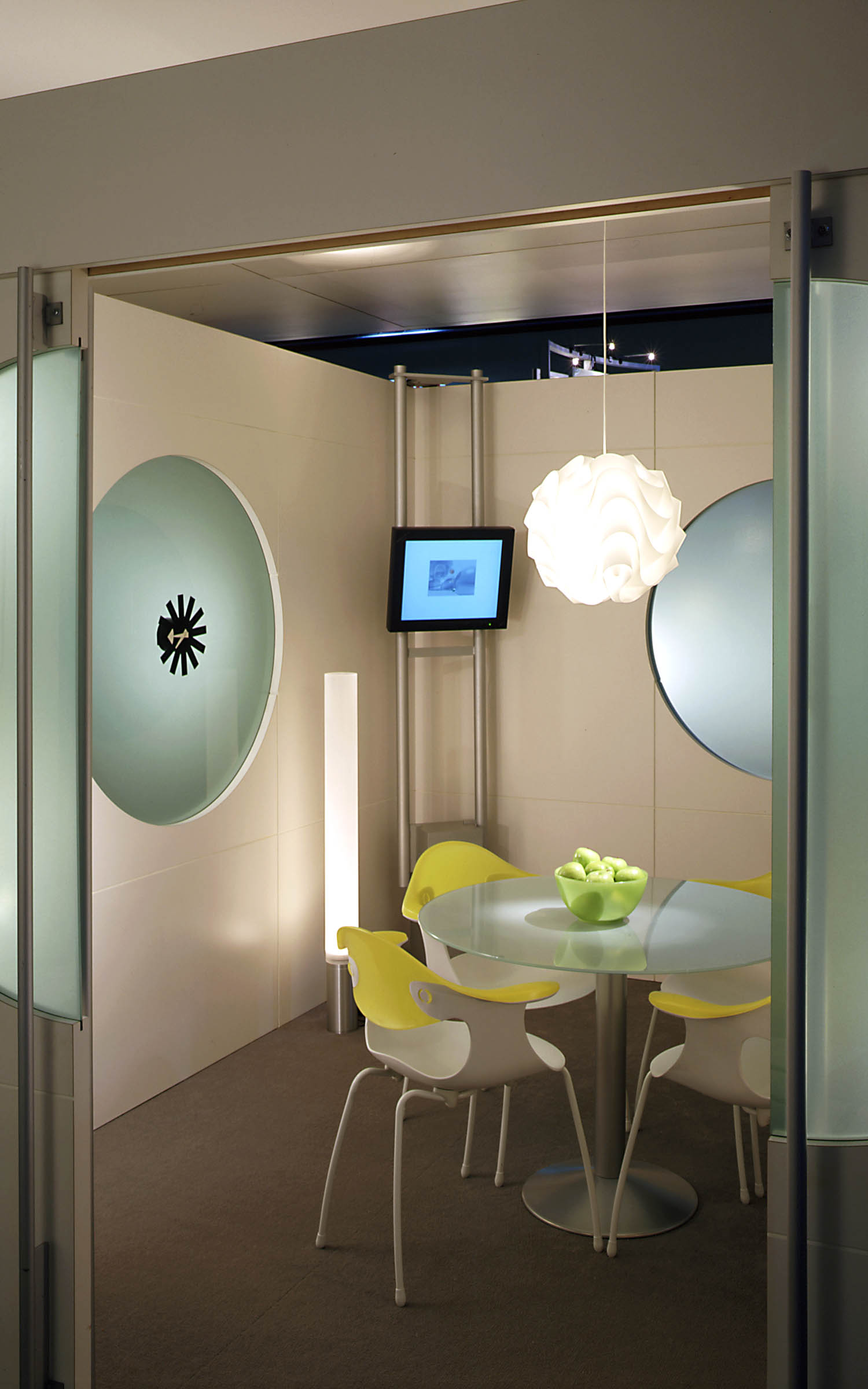
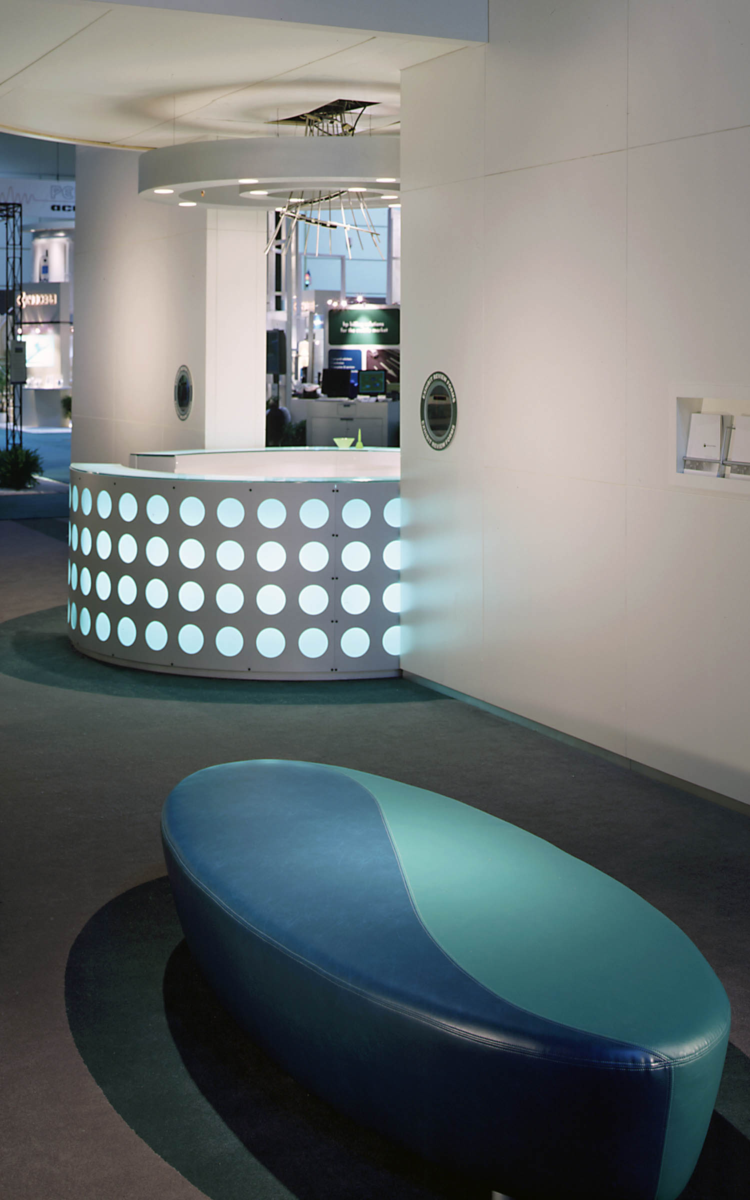
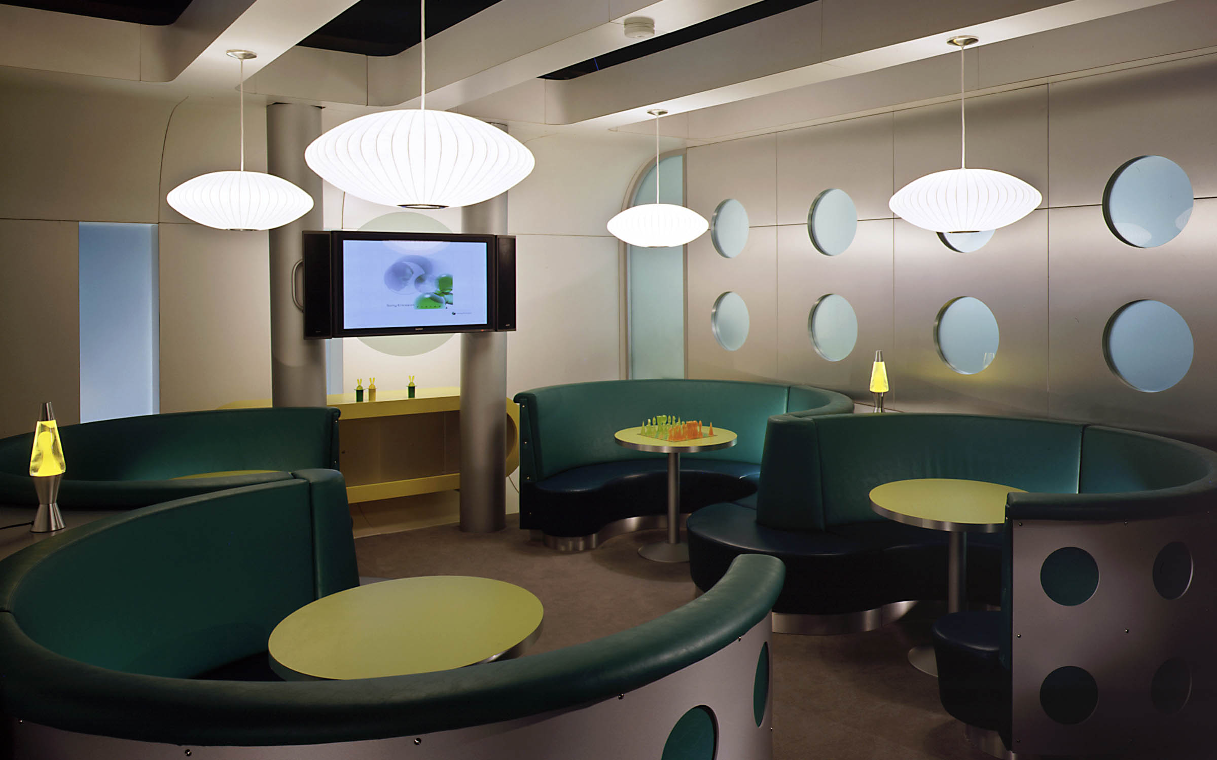
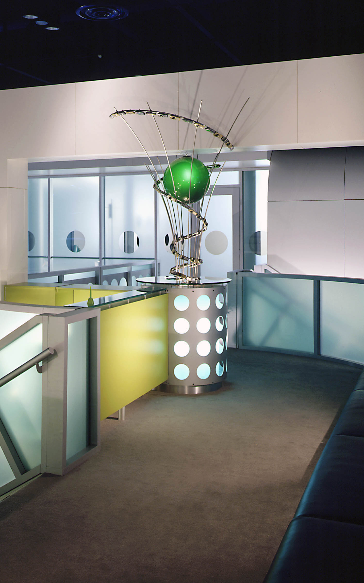
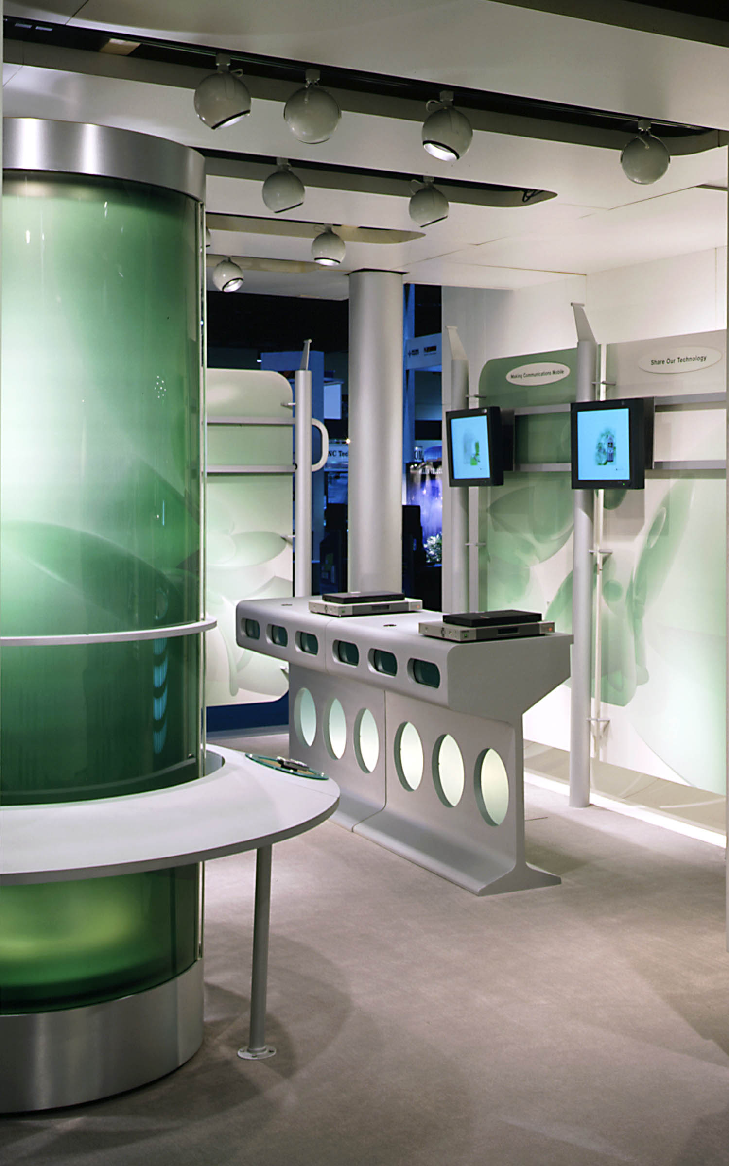
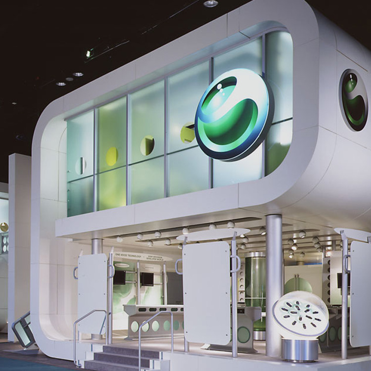
Lorenc+Yoo designed the exhibit in the shape of an interlocking “S” and “E” – a key component of the new company’s brand identity. Predominately white, apple green and yellow accent colors echoed the company’s new identity on conference wall surfaces, custom designed tables and credenzas. Lorenc+Yoo then used silver aluminum as a neutral tone on the internally illuminated reception desk, demonstration tables, and accent walls. Green translucent plexiglass set in silver frames allowed the “S” and “E” letters to read with clarity from a distance.
The Sony Ericsson exhibit is a landmark in a visually kinetic exhibit environment, much like a public building in a crowded city. It is a place within a place that boldly communicates the company’s vision as a major competitive player in the cell phone industry. Its sinuous modern composition is designed to literally and figuratively transport visitors to the new world of Sony Ericsson.
