Client: Pickard/Chilton
Location: Atlanta, Georgia, USA
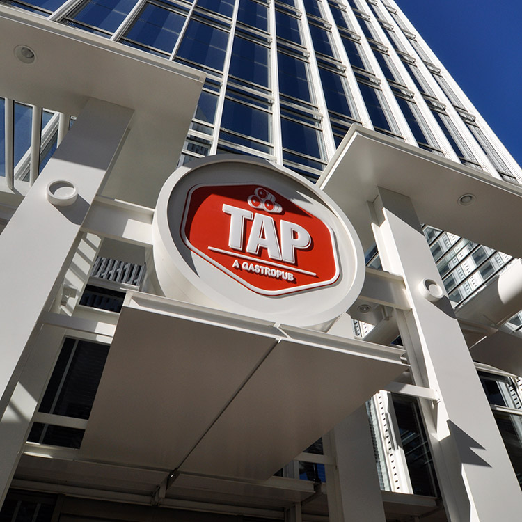
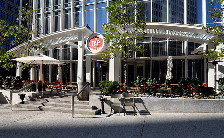
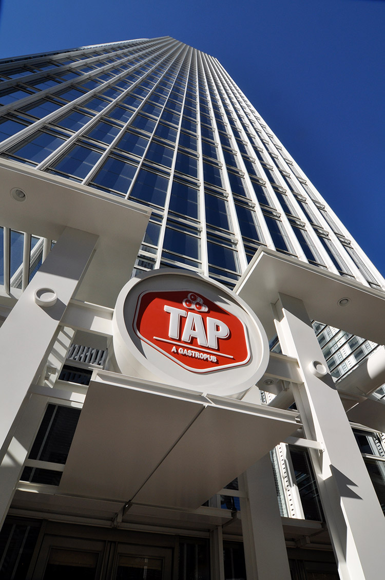
In addition to the lobby and parking signage, Lorenc+Yoo devised the canopy signage structure for TAP to fit the look and feel of bustling Midtown Atlanta. The design serves as an architectural accent to the building and includes a single, curved canopy comprised of three sections that appear to grow out of the building. Four columns anchor the canopy to the ground, and the TAP logo is centered above. A beer barrel shape contains the logo, which is lit internally and glows red with a subtle aura.


