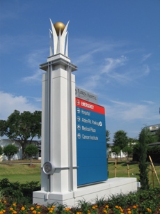
 Signage is an important element for any great visitor experience, but clear directional signage is critically important when someone’s health lies in the balance. When Florida Hospital Health Village chose Lorenc+Yoo to redesign its exterior signage system, the designers made it their mission to create a series of large landmark signs that would assist patients and their loved ones in arriving to their location as quickly and with as little stress as possible.
Working with the hospital’s existing design guidelines, Lorenc+Yoo’s signage landmarks convey the high quality of the healthcare provided at Florida Hospital. The signature entryway sign rests on a white L-shaped base with a crown-cut top, which draws the eye to the directional signals. A blue tablet guides patients to the hospital’s most visited locations, including the Cancer Institute, the main plaza and, most vitally, the emergency room. The guidance for the ER sits at the top of the tablet and is highlighted in bright red for immediate recognition. A large silver tab tops the directional tablet, clearly presenting the Florida Hospital identity.
Visible to both pedestrians and drivers, Lorenc+Yoo’s new signage system for Florida Hospital serves perhaps the most important wayfinding purpose: directions to life-saving healthcare.