Client: Woodruff Arts Center
Location: Atlanta, Georgia, USA
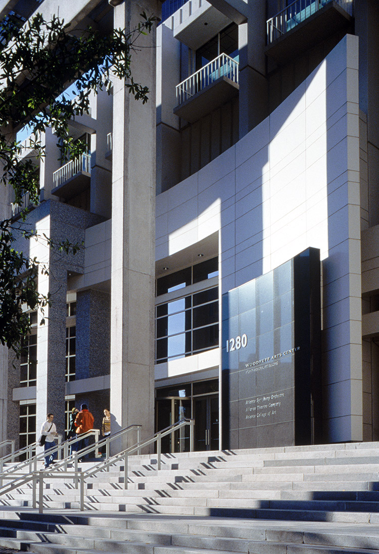
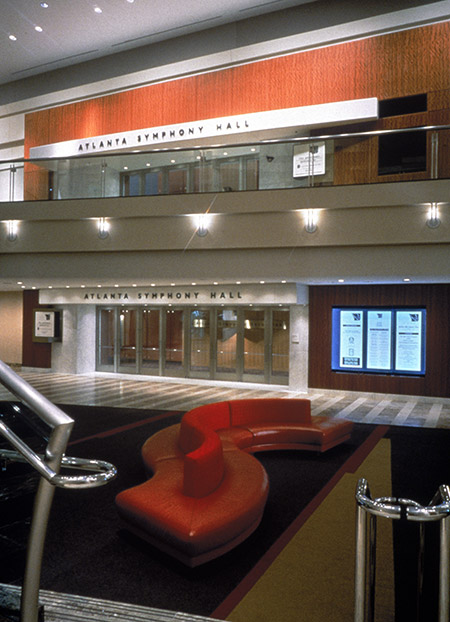
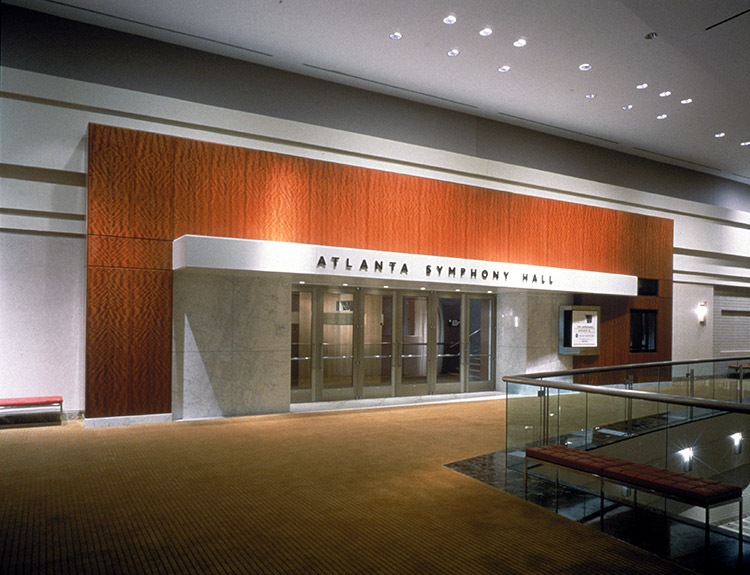
Lorenc+Yoo Design was asked to remake Atlanta’s premier cultural institution into a more inviting space. Working with a trimmed-down budget of $16 million, the designers collaborated on a plan that transformed the once mausoleum-like marble box into a place of light, free-flowing space, and entertaining activity.
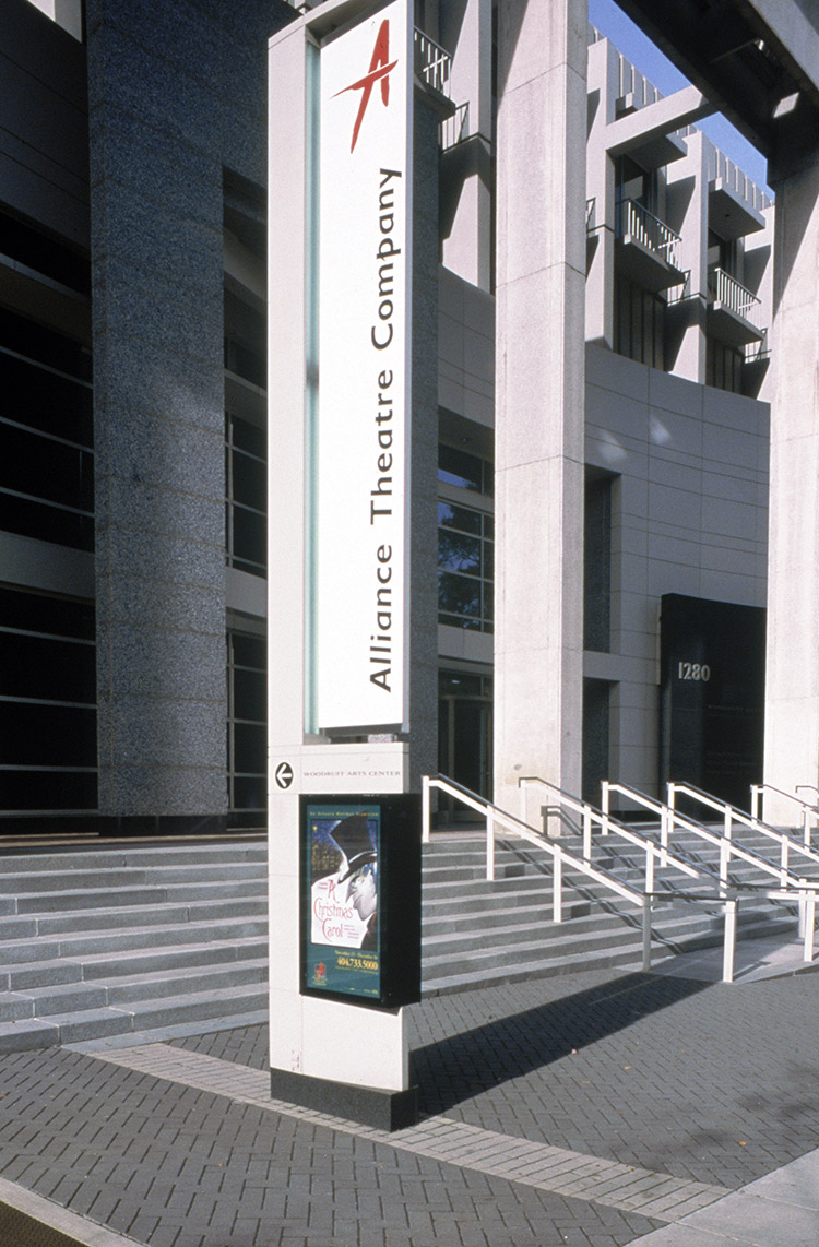
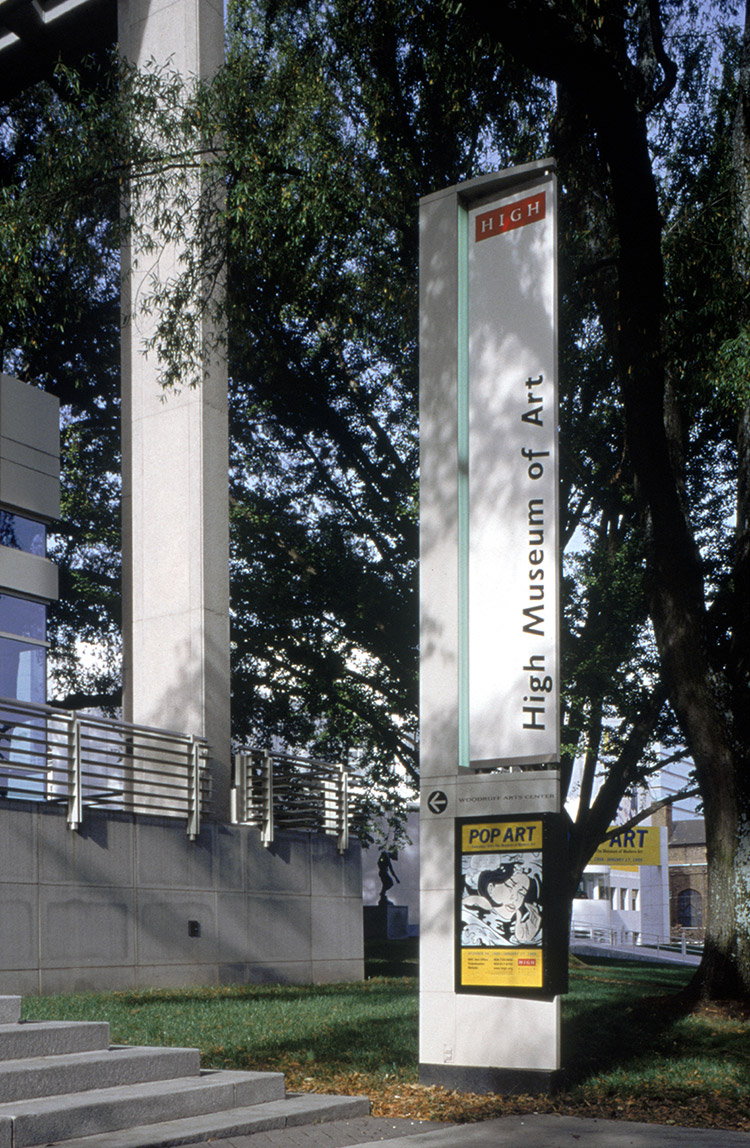
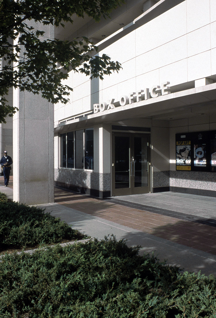
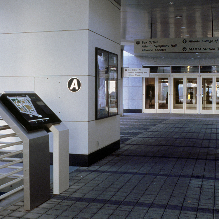
Designers had to create exterior marquis signage that served two critical functions: to inform the public of ongoing events at each of the center’s four institutions and to signal the architectural intent of breaking the box. Renovation construction added new light and openness to the building, and this distinctive marquis needed to reflect clarity in graphic communication for the arts center.
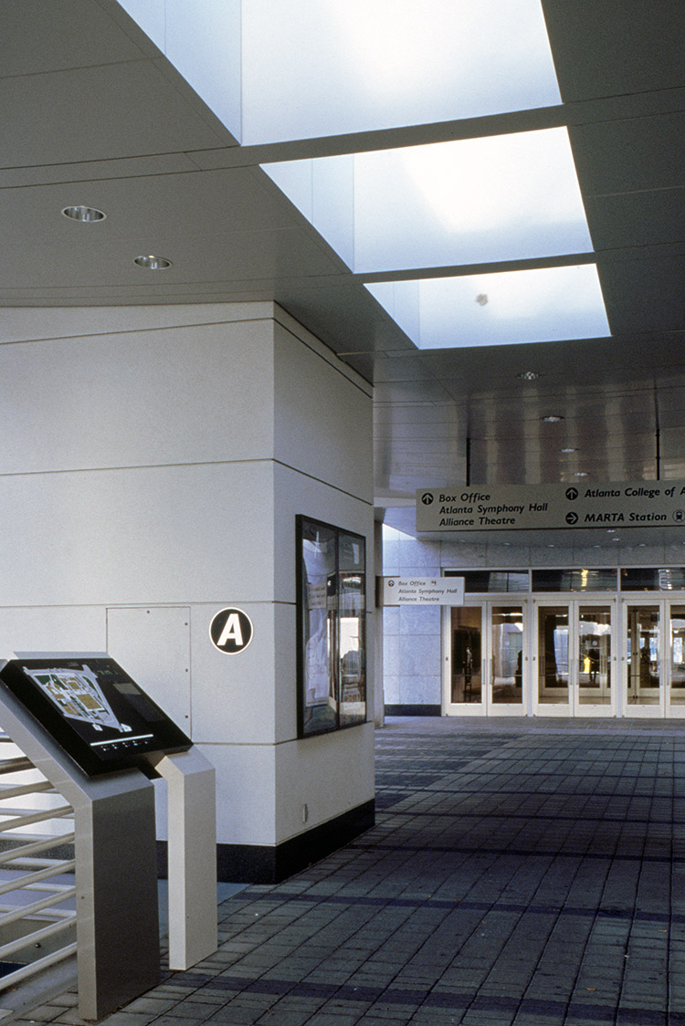
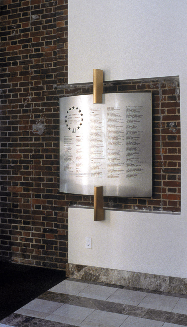
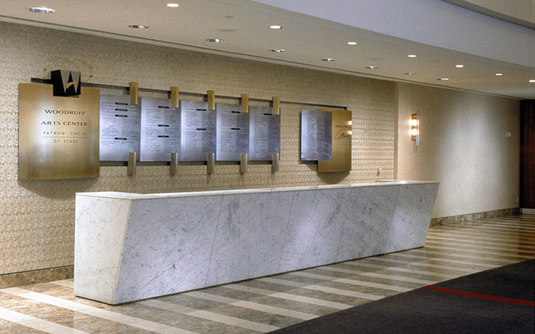
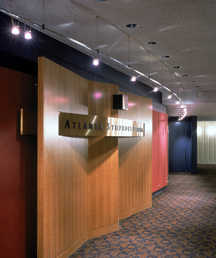
The building’s original interior graphics had been a confusing jumble of competing messages. Each institution designed, sized, and placed signage as desired. Corporate sponsors hung their own banner panes, with no regard to style, size, or color palette. Donors were recognized on flimsy silk-screened plastic sheets that changed yearly. The resulting scene was cluttered and, even worse, unsophisticated.
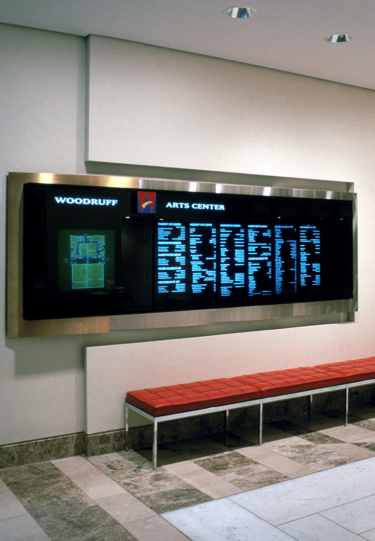
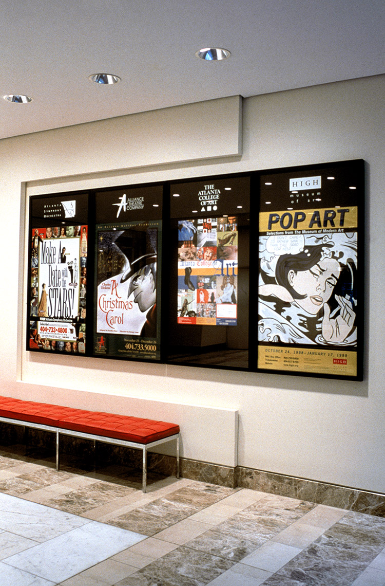
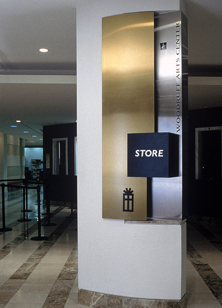
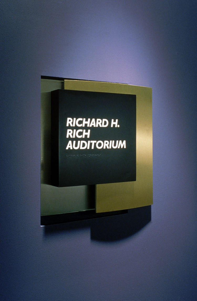
The designers worked closely with the architects and the institutions to define identities for the member institutions. The program established a format for signage that related to the architecture of the building and tied the signage to the structure in an attractive merge of form and color.
