 When Simon Property Group developed Firewheel Town Center in Garland, TX, it was creating more than a mall – it was creating a neighborhood community with an Americana feel. All of the details of the 785,000 square foot open-air shopping center needed to embody this theme, so Simon enlisted Lorenc+Yoo Design to create an environment that reflected a classic, small-town ambiance.
Recalling the “Gilded Era” of the 1890s and 1930s art deco period, Lorenc+Yoo designed the shopping center’s graphical elements to mirror those periods’ high level of architectural detail. Using brick and wrought iron accented with clean typefaces and custom aluminum medallions, all of the pylons, directional panels and signage reflect main street America.
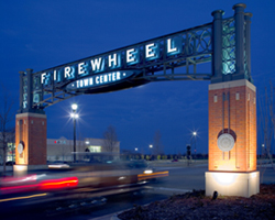
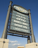
The center’s signature entry portal welcomes visitors with brick and concrete pillars embellished with placards of the Firewheel logo. Arching over the pillars, a steel gateway resembles detailed wrought iron and serves as the background to illuminated letters reinforcing the name of the center. Other Lorenc+Yoo-created elements at Firewheel include vehicular directional signs identifying tenants by color according to location, street signs, pedestrian directories and more.
 In addition, landscaped park and charming walkways provide a small-town experience, and more than 100 stores and restaurants provide options for the whole family. Lorenc+Yoo’s contributions provided authenticity to the environment with graphics, materials and typefaces to help Firewheel Town Center support its true Americana mission. The design was so successful, it won a Best in Show Award in the 2007 International Sign Contest. Click here to read more about this award.