 When General Growth Properties, America’s second largest mall-management company, approached Lorenc+Yoo Design to upgrade the image of its Burlington Town Center property, the design firm faced a unique challenge. While most malls are highly visible from their surrounding roads, generating traffic largely through their massive presence, Burlington Town Center only possessed a few feet of frontage on Church Street in downtown Burlington, Vermont. Passersby were often unaware that more tenants resided beyond the main entrance.
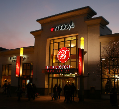
Surrounded by City Hall and other historic public buildings, LYD’s primary goal was to improve curb appeal while increasing awareness of the mall’s tenants. After painting the existing red brick façade with a fresh white paint coat to brighten the exterior, LYD accented the mall’s signature “B” logo by encompassing it within an internally lit convex acrylic dome all over a new welcoming canopy.
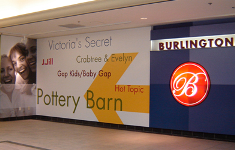
LYD updated existing sidewalk light poles with modern fixtures and added double-sided banners promoting key tenants that would otherwise not be seen from the street. Interior signage also directed visitors to signature shops in the quarter mile-deep shopping center through a series of digital graphics that displayed tenant names in vivid colors and contrasting point sizes.
 The budget and strict installation timeline were easily met, and the enlivened façade and emboldened signage presented the mall with a fresh look visible even from the mall’s small amount of street-facing real estate. LYD’s design reinvigorated Burlington Town Center and added a modern touch to downtown Burlington while keeping the site true to the historic area in which it resides. The project was such a sucess, it was a finalist for the Burlington Business Association’s Hertzel Pasackow Award for best architectural design.
For additional images of Burlington Town Center, click here.